Thursday, 24 March 2016

Evaluation Question 3. What kind of Media institution might distribute your media product and why?

Evaluation Question 3. What kind of Media institution might distribute your media product and why?

Which production company would you finance your film in the real world?


The production company we would have to finance our film would be Warp Films; they’re a more independent company and would be good at focusing on our more independent style of film. Warp films are also British and specify in targeting the British audience, they helped in ‘dead mans shoes’ and in ways is similar to ours as it follows characters and one specific character through its mental state towards the end of our 2 minutes.  


We also thought that Hammer Productions known for their 'Gothic' themes, this would go well with Warp Films as they both come from the same backgrounds in the type of films they help produce. Hammer specify into Thriller/Horror/Psychological Thrillers such as ‘The woman in black’ and ‘Let me in’ this is important as these films really represent our genre we want to convey and would understand the genre we are trying to portray. They even helped in the production of 'Psycho'.

HammerLOGO.jpg

We thought the Shane meadows would be a good director for our film 'Paranoia' due to the fact he is a low budget film director, with works such as 'Dead Man’s shoes' (a film we all really enjoyed), 'This is England' and 'A room for Romeo brass'. He has a way of directing dialogue and language that is muddled and over lapping, creating a more low budget gritty feel, that we thought connected with the audience more. He also uses urban locations and local cities for his films, something that we also used, the genres in his films are also representative of what we have in ours, thriller with psychological aspects.


Who would distribute your film?


The Distributors for our film would be Optimum Releasing (new theatrical releases), they helped in the distribution of 'Dead Man’s Shoes' in the Uk and Great Britain. Theatrical release: The date a new movie is entered into the theatre distribution system for public viewing. Alternate formats of the movie, such as DVDs, Blu-ray discs and video-on-demand, are scheduled for distribution a set number of weeks or months after the theatrical release. They’ve helped in distribution of ‘Kill List’, ‘Wolf Creek’, ‘The Railway Children’ etc.


How much would your film cost to make?

Our film is more of an independent film, it would have a lower budget due to the locations filmed in, the mis-en-scene and the camera and shots used. An estimate of around £600,00 to £700,00 for the entire film as a general rounding of money we would need to support our film.For the shots and equipment used we wouldn't need a super high budget, just a moderate budget suitable for a low key city based British Film.

How would your film be marketed? Any unusual ways to market your film?

Marketing our film we would produce trailers and teaser trailer so the audience could get a feel of our film before it actually released and they could go and see it. Along with these trailers we would have posters and also teaser posters to give the audience a feel of the age rating as well as the genre it is, giving more simple information that can be easily viewed by the public. These posters and trailers all are ways of representing what is going to be in the film, what its about and relaxing the good bits so people will want to watch on and see till the end 

Doing low key interviews and chat shows would be good in the actors being able to explain the film and promote the genre and conventions to the public, building up a type of hype.

Social media is a very important factor of the 21st Century so we would make a Facebook page and twitter page for the audience to refer to for information, behind the scenes and taster of what is to come in the film. This is also important in getting the word of our film around to get it more known increasing the sales, creating hash tags and spots that can be easily shared promotes and market the film to a range of people all over, not just Britain. 


poster
American-Horror-Story-Hotel
Teaser Poster AHS


How many screens would it open on? Arthouse or Multiple?


We would open our film in multiple screens, Arthouse and the watershed in Bristol is a really good place to screen our films as we have a generally low budget film and Arthouse is for creative films and we think the ‘Paranoia’ would do really well in there. Also screening it in cinemas is something that would be good in, as it would help to promote our film, we wouldn't have it in too many screens maybe around 200 screens ranging from cheaper cinemas from the Odeon and only a few bigger ones like deluxe. 


Who would star in it?

The Actors we would like to star in our film, for my character would be Natalie Portman (The black swan or Scarlett Johansson in 'Lucy', Amy would be played by Jodie Forster (The silence of the lambs, panic room), Tamzin would be played by Al Pacino (The Godfather, Scarface). All these actors/actresses are from films of the same genres we are trying to portray and that have similarities and differences with our characters.
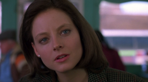

silence_of_the_lambs_5_foster
... longa

Tuesday, 22 March 2016

Evaluation Questions 1. In what ways does your media product use, develop or challenge forms and conventions of real media products?

1. In what ways does your media product use, develop or challenge forms and conventions of real media products?

NOT IN ORDER OF SEQUENCE IN OPENER

Convention: A way in which something is usually done 

1.
Shutter Island

Stairway scene
SHUTTER ISLAND

When I came up with this idea to the group of using a bird eye angle or a low angle of spiral stairs I approached this to the group after thinking about possible Psychological thrillers I had seen. 

Location
I remembered seeing 'Shutter Island' and that the locations used in that film had a very dark, creepy, horror, feel of the atmosphere, thinking it would go well with the genre I said this to the group. We ended up finding abandoned stairs in a car park and tried both angles of from the top and bottom and decided to use this shot with my character running up them frantically, possibly away from someone. 

This location uses conventions of psychological thrillers by the way the setting is dark and the thrilling atmosphere it is in. It's used in a typical way. 

2.


Above is various Thriller and Horror film title openers and we also have ours that we choose.

SE7EN
Titles, font and style
The titles for the owner of Se7en is very sketchy and quick, they flash on and off of the screen quickly, instantly giving you the feel of what type of film genre it is going to be. We wanted to base our film title off of Se7en and scrolled through trying to find a font which would work.

We found the font that we used on the iMac, it typically represents the thriller and horror genre that we were going for in our opener and is representative of Se7en by the sketchiness and see though parts of the font.

We named our film 'Paranoia' due to the fact the our character was essentially paranoid about something that would be revealed later in the film. the definition means : a mental condition characterized by delusions of persecution, unwarranted jealousy, or exaggerated self-importance, typically worked into an organized system. It may be an aspect of chronic personality disorder, of drug abuse, or of a serious condition such as schizophrenia in which the person loses touch with reality. 

This opens a huge door for our audience to speculate and wonder of what is going to happen next, also the way the title is placed in the opener, with the aerial shot gives the impression Amy's character is being followed. The sketchiness and see through parts of the font as well show the thriller genre and sketchy mindset of characters throughout. 

This can lead to paranoia by her character as well as The main character charlie, also the way the other characters act in the underground can suggest paranoid behaviour. Which could be caused by any number of reasons.


3.

Gang meet up scene

Dead mans shoes
Harry Brown underpass scene
In the underpass scene we wanted to go for the vibe of a gritty low budget British film, we wanted to use the graffiti in the scene and the darkness of the underpass to represent specific groups (gangs) and the fact that danger is ahead.

Dead Mans Shoes 

When filming we all agreed that we like the way Dead man's Shoes was directed in the way the scripts were overlapping an muddled, the opposite to standard hollywood acting of speaking and waiting for a response.
When filming we took ideas of the film and used it in the acting and how the characters were shown, we wanted to get a medium shot of all of them and include a close up on hand held to show the emotions and to feel like the audience were more present. We used the conventions of the characters from Dead man's, to represent our own and the shots of multiple characters at once.

Harry Brown 

After filming we found a scene from a film called 'Harry Brown' which is also a births based gritty film which involves the same conventions we used in locations of urban cities as well as the characters and social groups of gangs. The underpass scene in this film really typically showed the same type of vibe as ours, and also used the lighting and characters as we used.


4.

Still travelling to the underground

In this shot, we see Amy's character travelling into the underground and the transition between the light and darkness in the scene, which could represent her walking into the unknown and the danger that is about to happen.


5.


In the corridor
AHS
Se7en 
Here in this scene we incorporated multiple aspects of films into one of our scenes which was really fun to do and edit.

SE7EN

Genre and colour
We took from Se7en the sepia type colour tone that was present in the fast paced opener, in ours it created an older effect adding to the genre we were looking for which was Thriller/Psychological Thriller and horror ish.


AHS
Looking into American Horror Story was super fun, there were multiple aspects we took out of there openers, teaser trailers and general scene which were really good to play around with and see what would work.

Composition and location
From the 'Hotel' series we took the composition of the corridor and the location of a narrow set where the camera would be centred and still, also the composition of the person that would be moving. Our character was generally centred and the wideness of the shot got in the floor and ceiling lights, this added the the Thriller genre mise-en-scene and was really effective with the editing we did after.

Editing
The editing in AHS is renowned and is a key feature throughout the series and especially in hyping up the trailers and teasers.


6.


Tripping in the corridor


AHS
In this scene very near the final of our opener, I think we use and develops from the conventions of Tv show 'American Horror Story', we decided as a group last minute in filming that we wanted to do an impressionable finale. Resulting in the trippy /jumpy horror scene in which the person has possibly taken the drugs or product they stole. 

Special Effects This scene was influenced by the opening of AHS but was also adapted in the way we added extra's that may not be in the actual opener of AHS. We added the up close silhouette like shot of the person in the corridor. 

We took from AHS the shots of things getting closer to the camera with suspenseful music, also managing to find a location in a car park with a very narrow corridor with the same stripes going down, creating an illusion. This worked well with our psychological aspect, by having a 'triply' scene it helped tie together the genre's and give the audience a final wow so they wanted to watch on.

The Jump cuts represent her mindset and give the audience the idea she has taken something. 


7.
Running scene

Rocky

I can''t get over how perfect this looks, we are matching :')))))

ROCKY II

Camera work and location
This scene is a lot like Rocky's in 'Rocky II' after we filmed it we saw it represented the same  compositions and camera movements like in Rocky. The composition of the character running in and across the screen was basically exact to Rocky's and the same rule of thirds principle was used in the depth of the field of the background (just slightly different) and where the character was travelling to.

The location was a wide shot of the top of the car park we used, this showed buildings and lots of bristol in the depth that the viewers could look at. 


8.
eye open shot


Twilight opening eye shot
TWILIGHT


How characters are introduced and story of the opening

In the start of 'Twilight' the scene begins with Bella opening her eyes and we realised that this is very representative of our opening few seconds. In Twilight Bella opens her eyes and instantly the camera quickly shoots to the things around her and close ups to things in the room. 

Instead with our opener when the eyes open of our Charlie, it instantly flips to a flashback of what happened before, this is different because the conventions of the genre are different to twilight. We need to make ours a clear Thriller genre so we added in a stair scene which showed the gritty dark atmosphere. 

9.


Slumdog Millionaire


torture scene

SLUMDOG MILLIONAIRE

With the flashbacks we used we came up with the idea of having a flashing scene representing a possible torture moment the character remembered. Ideas from Slumdog Millionaire as well as Prison break were taken and we used the conventions of the story from Slumdog, that they're being forced into something they don't want to do. 

This adds to the thriller convention as it makes people ask what happened and why has that happened, as it only appeared for a second it could be seen as a shock to the audience as to why they're in the coma. We used this scene in an unusual way as instead of it being a big part of the film like in Slumdog, its only used really quickly to give a glimpse of what has happened adding to the mystery. 

Sunday, 20 March 2016

Evaluation Question 5. How did you attract/adress your audience?

Evaluation Question 5. How did you attract/adress your audience?


Editing  - Towards the end becomes very jumpy/sketchy/trippy like in the start of American Horror Story, linking to the thriller and horror atmosphere

- Editing it often like dead mans shoes, very independent to create the feel the audience could be there, in the underground 

- The sketchiness of the editing in the ending links to se7en’s opener with the suspense of flicking to black screens, being quick and fast paced changing to different shots, creates suspense

- The still camera shots showing characters and creating confusion but wondering in the audience like in the opener of fight club

-- Our opener staring with someone waking up after a coma and torture scene relates to fight cub and shutter island with the flashback being used to fill in the gaps and want people to watch on 


The USP of your film

(unique selling point)
- The editing towards the end becomes very triply and is something we thought our target audience would find really cool and interesting

- Urban locations make the audience connect with the film more as they may know the places and have been, such as Dead mans shoes


- The mix of  genre’s having a psychological thriller, with hints of horror throughout with the age of the actors 


- Being all young actors in the opener and not asking anyone older to star in it may appeal to others to see the talent we have 


- It leaves the audience to think for themselves what could come next in the opener or what could happen in the end of the film


- The flashback create the feel of wanting to watch on in the opener


Tripping in the corridor

Urban Location

Underground


Genre Conventions - The character knows more than the audience does, the voice over, like in Fight Club

-The heart beating sound effect gives the thrilling illusion something is going to happen next 

- Close up's to show emotion and facial expression was used at the start of our opener

- The locations, were gritty and urban creating the feel of it being a horror/thriller genre

- There were dark silhouettes and dark colouring in certain scenes to make of a more thriller atmosphere

-The lighting was all natural and changed in certain scenes to seem more of our genre

- The editing was quick towards the end and triply with lots of jump cuts, creating the atmosphere of the thriller genre

- Our main character was a strong female role but also showed the weakness of running away when they were scared 

-The music throughout created suspense like in a thriller

- Music in the ending was very fast and repetitive, giving the quickening feel of the scene 

- Flashback were used in the psychological thriller aspect of slowly giving the audience information so they'd want to watch on


main character


Use of Music / Sound - Dramatic and suspenseful music like from Shutter Island creates a suspense to something coming

- The quick suspenseful sound effects acting as almost a clock at the start and the end, like in American Horror Story give the mood of the thriller/Horror 

- There was a voiceover at the start linking to fight club where the voice over was at the beginning, although ours stopped after a few seconds

- We used a heartbeat sound at the start to create suspense this is like the ticking of clocks and repetitive  suspense sounds in se7en and AHS


Use of Mise-en-scene - We used urban locations such as  the underground scenes feel like Fight club  and dead mans shoes to make the audience feel like they were more present in the opener

- causal clothing with the big fur coats to create a sense of wealth, possibly because of the drug aspect

- Low lighting and dark colour were used to create a thriller atmosphere with the music as well like in Shutter Island

- The settings were used in a variety to show 
the use of Bristol and the aspects of middle class

- Low key lighting was taken from fight club and high key lighting was from dead mans shoes when Amy's character was walking to the underground 


Cinematography -  Certain scenes were dark and gritty with dull colours and lighting like Shutter Island when they're going through the hospital

- Close up shots were used like in dead mans shoes to show emotions and facial expressions


- Colours in the underground were vibrant and showed the urban side of our film


- When Amy walks in the darkness it represent her walking into danger 


NOTE : not my mind map only a reference 


Saturday, 19 March 2016

Evaluation Questions 7. Looking back at your preliminary task, what do you feel you have learnt in the progression from it to the full product?

Evaluation Questions 7. Looking back at your preliminary task, what do you feel you have learnt in the progression from it to the full product?


- We learned to take lots of shots especially the match on action to find the best one

- That shot reverse shot is herder than we thought, especially when we are goofing around


- We used the 180 line in the shot in the underground, but decided it didn't go well with the shots so took it out, we learned to take multiple shots and make sure the line fitted well and didn't look dumb

- Shot reverse shot was used with the match on action when my character was running to open the door, the match on action we repeated a few times to get the action right


Friday, 18 March 2016

Evaluation Questions 2. How does your media product represent particular social groups?

Evaluation Questions 2. How does your media product represent particular social groups? 


The social groups represented in our film opening is...

- Gender: Our cast is all females it shows a strong female presence 

- Gender: Also non-stereotypical of women

- Age: The cast is all late teenagers and shows a stereotypical aspect of troublesome teens

- Class/status: Class is shown throughout by the costumes worn (fur coats) to seem higher,  but there are mostly middle class people by the urban locations chosen that make it seem slightly lower class with the costumes. This gives the illusion that the characters are either working or middle class but somehow can afford big fur coats.


- Class: Not a typical representation of the Working/middle class


The main character in our opener 'Charlie'


I thought that a possible character from another film that could represent my character could be presented by 'The girl with the Dragon Tattoo' actress 'Rooney Mara'. In the film her character is seen is 'Lisbeth Salander'.


Lisbeth Salander character in 'the girl with the dragon tattoo'

Another possibility...

Scarlett in 'Lucy'
This is another Character that I think would be good to play the lead role of our main character.

In thought I think that Scarlett in 'Lucy' would be more representative of our main character and would be good to analyse similar and different points. 

Comparing with 'Charlie' with 'Lucy'


Similarities
Differences 
- They're both female characters and are the main roles

- Both characters take some type of drug and have a reaction to it


- Both characters are brave and fearless to others 


- 'Lucy' has a lot of the same psychological/thriller conventions our has


Positive female representation showing a good representation  of females

- Both have strong female presences and little men presences

- They both got caught over their heads in the deals they were matched in 
- The age difference between them, our character is late teens and Lucy is mid-late twenty's

- In Lucy her character gains control of her mind and psychokinetic powers, where as ours just has a trippy episode from drugs


- Scarlett is seen as very fearless, where as our character fleas at the scene and runs

-The age difference is slight, ours is more focusing on late teens and their representation where as Lucy is more of mid-adult so shows different social groups


I choose this character to be a representative of my character in the opener as I think that Scarlett's main character 'Lucy' is a really good representation of not only our character but our film in general and the conventions of our genre. 

This character specifically fitted the ideas and goals we wanted in the opener, she is fearless, brave and is a strong positive representation for females being the main role. This character fits well with our psychological aspects of our film and the fast paced action conventions of our thriller.